However “normal” things still seem.

They’re about to get a LOT WORSE.
QUICKLY.
No matter which way you look at it.
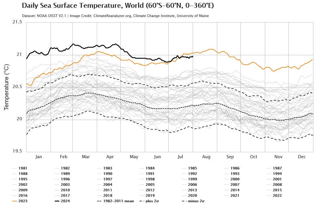
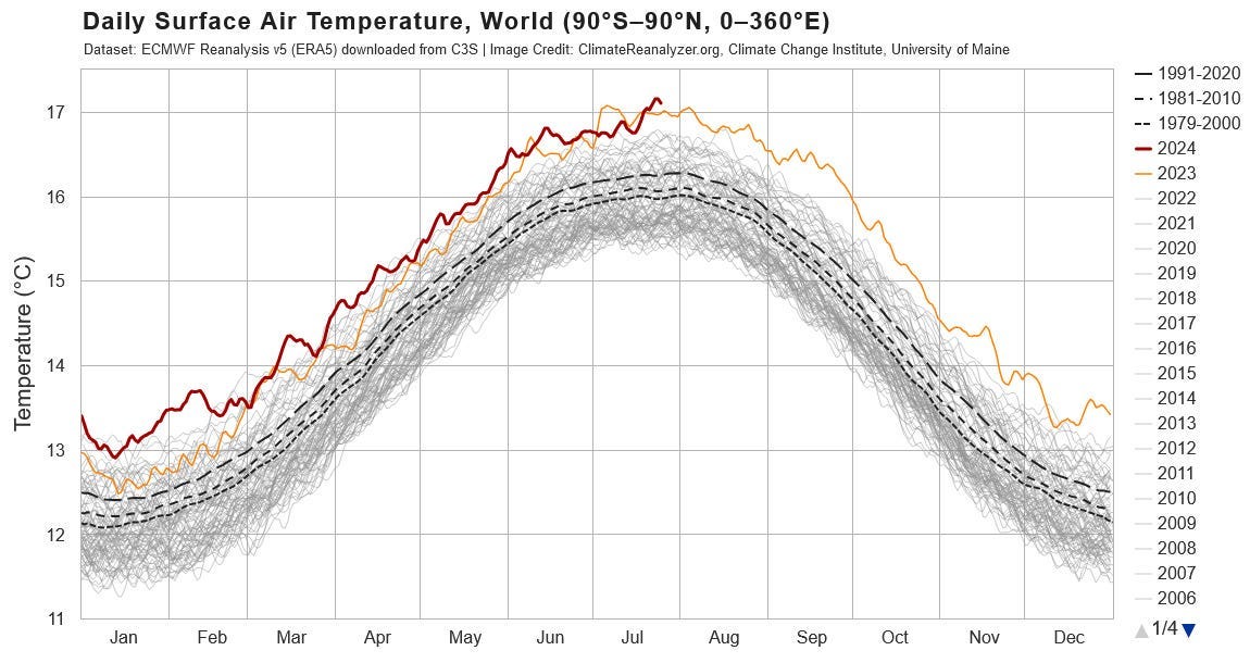
Now, if you follow my stuff regularly, you know that I mostly focus on how much HEAT is building up in the oceans. However, when we talk about “Global Warming” we focus on the Surface Air Temperature (SAT).
Today I came across a great piece of analysis in the r/collapse subreddit I’ve been hanging around in lately.
ERA5 global surface air temperature — how fast is our temperature increasing? by allurbass_
u/allurbass_
So, a while ago I saw a comment on here that peaked my interest. The comment claimed certain timespans between us hitting key temperature increases for a first time for a monthly average, to us then hitting said temperatures for our yearly average. So I started looking at the data myself and played around with them a little in Excel.
Data source: sites.ecmwf.int/data/climatepulse/data/series/era5_daily_series_2t_global.csv
Website where data is sourced from: Climate Pulse (copernicus.eu) — if you love the color red, take a look at Antarctica. (written on 01/08/2024)
Method:
So I exported the daily temperature anomalies, but since they use 1991–2020 as baseline, we have to add 0.90°C to get the temperatures above pre-industrial baseline. (source: Global temperature exceeds 2°C above pre-industrial average on 17 November | Copernicus) — according to their data on 17/11/2023 we were 1.17°C above 1991–2020 average and 2.07°C above pre-industrial baseline, hence their 1991–2020 average is 0.90°C above pre-industrial baseline.
If we use Global temperatures remain above pre-industrial levels for 12th consecutive month (awe.international) as a source, the 1991–2020 average is 0.88°C above pre-industrial baseline. This changes nothing to the dates below. I checked it and all dates stay exactly the same.
The results:
First day above 0.5°C = 19/05/1940 (El Niño) (might be earlier, but no earlier data available)
First month above 0.5°C = January 1944
First year above 0.5°C = 1980
First day above 1°C = 09/12/1987 (El Niño)
First month above 1°C = February 1998 (El Niño)
First year above 1°C = 2010 (El Niño)
First day above 1.5°C = 05/10/2015 (El Niño)
First month above 1.5°C = February 2016 (El Niño)
First year above 1.5°C = 2023 (El Niño)
First day above 2°C = 22/09/2023 (El Niño)
First month above 2°C = ???
First year above 2°C = ???
From the first month of 0.5°C temperature increase to the first year of 0.5°C temperature increase, it took 36 years.
From the first month of 1°C temperature increase to the first year of 1°C temperature increase, it took 12 years.
From the first month of 1.5°C temperature increase to the first year of 1.5°C temperature increase, it took 7 years.
Prediction of us hitting a yearly average of 2°C above pre-industrial baseline for the first time, based on the last two 0.5°C increases: 7–12 years.
This means we’ll see it for the first time between 2031–2036, but since it seems to be accelerating, it might be a tad earlier too. Most likely we’ll see this temperature increase during an El Niño, since that’s when most records seem to be broken (which makes sense, of course).
Source El Niño: Did You Know? | El Niño: A Historical Perspective | National Centers for Environmental Information (NCEI) (noaa.gov)
One tiny sliver of hope: during the last two 0.5°C increases, the time between the first day and first month of a certain temperature increase (1°C and 1.5°C) was only a couple of months. We hit 2°C on 22/09/2023, but haven’t hit a monthly 2°C average since, so that’s something I guess. (peak was November 2023 with 1.76°C above pre-industrial baseline. This discrepancy could also be due to the fact that we’re taking an arbitrary number every 0.5°C. The results might be different if we were looking at 0.8°C / 1.2°C / 1.6°C — but I personally didn’t check these). Someone with too much time could do one for every 0.1°C increase, but it won’t be me.
We can look at the data in another way as well:
Yearly average temperature increase from 0.5°C to 1°C took 30 years
Yearly average temperature increase from 1°C to 1.5°C took 13 years
If we linearly extrapolate this, we might hit a yearly average of 2°C of warming in 6 years. (5.59 years rounded up, but that’s way too simplistic, just another fun thought experiment).
This would have us at 2°C in 2029, which is still very close to my personal prediction, but it would take a severe El Niño in my opinion. Only time will tell.
Disclaimer: this is NOT science, but it was a fun thought experiment and in line with my expectations (personally I’m betting my fake money on 2°C warming for a 12-month average on 2032, plus/minus 2 years.) I think the recent increases are mostly due to aerosol masking effect decreasing, as published by James E. Hansen e.a. in their “Global Warming in the Pipeline” paper ((PDF) Global warming in the pipeline (researchgate.net)) which I recommend everyone to read.
I can’t seem to add my Excel file as attachment to this post, so if you want to go over the data yourself, you can find them in the source above, then copy them in Excel & play around with Pivot Tables & averages. If a lot of people ask for the data in the comments, I’ll upload my Excel file and make it available, but it might be better if the data is checked independently from mine.
Thanks for all the fish.
— — — — — — — — — — —
That’s how fast things are CHANGING.
Here's what that MEANS. BY 2035, AT THE LATEST.
Probably by 2030.
This map was done by the Rhodium Group for the NYT report on Climate Change in 2021. This is their “worst case” map, +2°C of warming by 2050. Realistically this is 2030.
So is this.
Are you beginning to SEE what's about to happen?
No matter “how normal” things still seem. The trend-lines are very clear. This is what’s “about to happen” over the next 5–7 years. Our world is about to morph into that new world.
Because warming has accelerated.
Even Zeke Hausfather admitted it last year.

I Study Climate Change. The Data Is Telling Us Something New. -NYT October 2023 Opinion by Zeke Hausfather.
Where he stated.
“While natural weather patterns, including a growing El Niño event, are playing an important role, the record global temperatures we have experienced this year could not have occurred without the approximately 1.3 degrees Celsius (2.3 degrees Fahrenheit) of warming to date from human sources of carbon dioxide and other greenhouse gas emissions.”
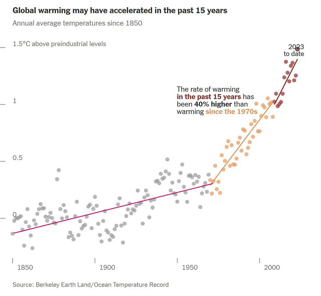
“While many experts have been cautious about acknowledging it, there is increasing evidence that global warming has accelerated over the past 15 years rather than continued at a gradual, steady pace. That acceleration means that the effects of climate change we are already seeing — extreme heat waves, wildfires, rainfall and sea level rise — will only grow more severe in the coming years.”
“I don’t make this claim lightly. Among my colleagues in climate science, there are sharp divisions on this question, and some aren’t convinced it’s happening.”
Yeah, Zeke. Saying shit like this can get you labeled as a “Doomer” and cost you your credibility.
Zeke has since “backed away” from this position. Which shows the CYA position Climate Moderates are taking right now. There is a lot of “staking out” of “Alarmist positioning” going on in Climate Science right now.
Just in case the Alarmists are are right and the CLIMATE PARADIGM suddenly “shifts”.
They hope to be able to “surf the shift” and stay relevant in a changed political landscape. Gavin Schmidt at GISS has also been saying some downright “doomer” stuff in “small market” interviews. The “political science” guys seem to be nervous and on edge.
They understand “how quickly” we can go from “OK”.
To this.
In just a matter of years.
Report: Warmer planet will trigger increased farm losses.
Extreme heat is already harming crop yields, but a new report quantifies just how much that warming is cutting into farmers’ financial security.
For every 1 degree Celsius of warming, yields of major crops like corn, soybeans and wheat fall by 16% to 20%, gross farm income falls by 7% and net farm income plummets 66%.
Those findings, reported in a policy brief released Jan. 17, are based on an analysis of 39 years of data from nearly 7,000 Kansas farms. The brief is a collaboration between the Cornell Atkinson Center for Sustainability, the Environmental Defense Fund (EDF) and Kansas State University.
We are about to see a SIGNIFICANT loss in agricultural production by 2035. At the latest.
I agree with u/allurbass_, I think a +2°C year is going to be “officially” around 2030. I took a different tack from u/allurbass_. For the last few years my focus has been on the Rate of Warming or RoW.
Here’s my analysis.
The significance of the Rate of Warming (RoW).
From 1850 to 1980 the RoW averages out at around +0.08°C/decade (per GISS).
roughly +0.96°C in 120 years.
From 1980 to 2010 the RoW averages out at around +0.18°C/decade (per GISS).
roughly +0.54°C in 30 years.
Since 2010 the RoW has been AT LEAST +0.36°C/decade (per GISS).
meaning +0.9°C of warming (officially per GISS) happened around 2020.
The global temp for 2023 averaged out around +1.56°C (per GISS) or +1.65°C per Berkeley Earth.
Now, Hansen notes that the Albedo decline sharply accelerated around 2014 so that the EEI jumped from about +0.2W/m2 in 2004 to about +1.8W/m2 by 2023.
So, what’s the RoW for 2014–2024?
Answer — We don’t quite know yet. Ask again in January 2025 when we have a full year’s data for 2024.
BUT YOU CAN BET,
It’s going to be higher than +0.36°C/decade.
NO MATTER HOW YOU LOOK AT THE INDICATORS.
They are all pointing to the same conclusion.
+2°C (officially) between 2030 and 2032 is the MOST PROBABLE outcome. Resulting in a 30% to decline in global agricultural outputs from current levels.
This is the “most likely” outcome for the next 5–7 years.
When I tell you this, I’m not FUCKING KIDDING around.
We have the rest of this year. In 2025 things will get RAPIDLY WORSE.
I’m sorry.
The Climate Crisis got here much “faster than expected”.
That’s my “short take” on this.
rc — 080124
For a more in depth discussion of what those charts mean here is my “most read” piece.
“In the end, it always came down to food” Morgan Jones, Walking Dead, Season 3


It's already dystopian in the US even without the rapidly degrading climate breakdown, but we drown ourselves in toxic positivity and consumer comforts. Nobody wants to hear this kind of stuff, because that would make it real. The populace are frogs in the pot, not even feeling the heat as it slowly increases. Politics has found a way to solve the issue. Just write laws where you can't mention it, and cut checks from nothing to YOU paying for the damage.
Hypernormalization.
Without analyzing all this and clicking through the links, I'll just say this. Buffalo, NY hit 90° F today. There have been numerous days like that here in recent weeks. Having graduated from college in Buffalo in the mid 1980s, and moving away for 30+ years, I can tell you that NEVER happened. The winter was absurdly warm as well. Two winters ago, we got hammered, but it wasn't like the infamous winter of 1977. It was because Lake Erie never completely froze over as it should. Yeah, I do my research and writing, too, but direct experience hammers it home. 1.5C is dead. Things are deteriorating far faster than predicted.