The Crisis Report - 08 : Heat doesn't "just happen" - Part Three
Additional notes on Albedo Diminishment. I’m actually being “conservative” when I tell you that things are bad.

So, if you don’t know what this graph is, then you don’t know what’s happening with the climate system right now. I’m not going to explain it again, this is one of the most important graphs in the history of climate science. It’s right up there with the “hockey stick” graphic.
So, learn what this graph means: it’s important.
Here’s the paper it’s from.
Earth’s Albedo 1998–2017 as Measured From Earthshine pub. Aug 2021
Here’s my discussion and analysis.
The Earth's Albedo has dimmed since the 90's. In the clinical language of science, this is an "unexpected feedback".
Here’s some additional things you should notice about this graph.
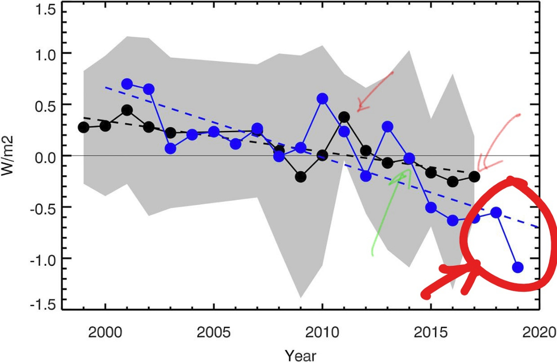
When Goode says that the Earth’s albedo has declined about 0.6W/m2 since 1999, he’s not referring to where the blue dotted line ends up in “2020”. He’s talking about the black-dotted-line between 1999 and 2017.
The one that starts at +0.4W/m2 and ends at -0.2W/m2.
That’s the 0.6W/m2 of additional “climate forcing” due to albedo diminishment that Goode is talking about.
When Goode talks about the unexpected decline since 2010 he’s discussing the the part of the graph between the two red arrows.
This part of the graph shows the albedo declining from 2010 to 2014, when Goode thought it would then go up again. Goode has stated.
“I would have bet my house that those last three years were going to look just like the previous 17. Now we have this really cool mystery.”
What Goode is talking about is what happened in 2014 (the green arrow). They expected that the Earth’s albedo would start climbing again, like it did in 2009. Instead it went down, for the next three years.
Goode’s study stops in 2017 because his 20 year project ran out of funding.
Personal Note: Oh, gee. Wouldn’t it have been great if Goode’s project hadn’t run out of funding in 2017. Then WE WOULD KNOW what the albedo was doing. Who, oh who was President at that time?
The NASA CERES project did not. In this graph, their data goes out to 2019. They show a decline of 1.8W/m2 in the planetary albedo level from 2000 to 2019 (red circle).
The NASA CERES data indicates the problem is three times worse than Goode is reporting in his conclusions.
“We have reported a two-decade long data set of the Earth’s nearly globally averaged albedo as derived from earthshine observations. Stringent data quality standards were applied to generate monthly and annual means.
These vary significantly on monthly, annual, and decadal scales with the net being a gradual decline over the two decades, which accelerated in the most recent years (much of the decrease in reflectance occurred during the last three years of the two-decade period the team studied). Remarkably, the inter-annual earthshine anomalies agree well with those from CERES satellite observations, despite their differences in global coverage, underlying assumptions to derive the albedo, and the very different sensitivities to retroflected and wider-angle reflected light.”
The two-decade decrease in earthshine-derived albedo corresponds to an increase in radiative forcing of about 0.5 W/m2, which is climatologically significant (Miller et al., 2014). For comparison, total anthropogenic forcing increased by about 0.6 W/m2 over the same period. The CERES data show an even stronger trend of decreasing global albedo over the most recent years, which has been associated to changes in the PDO, SSTs and low cloud formation changes. It is unclear whether these changes arise from the climate’s internal variability or are part of the feedback to external forcings.”
Using Goode’s number is being “conservative”. Reality is probably worse.
How do I “know” that the albedo level hasn’t naturally cycled back up on it’s own. What makes me so confident that we went over a “tipping point” in 2014?
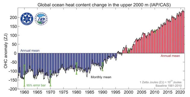
Here’s the “tell” that things haven’t improved.

Even the deepest, coldest parts of the ocean are getting warmer
How fast are the oceans warming?
Ocean Warming Is Accelerating Faster Than Thought, New Research Finds
The Oceans Are Warming Fast, and Our Lives Are About to Change
Ocean warmth sets record high in 2021 as a result of greenhouse gas emissions
Another Record: Ocean Warming Continues through 2021 despite La Niña Conditions
Heat in World’s Oceans More Than Ever Recorded : This one is interesting because it states that the “Hiro Count” is now at 7 Hiro’s per second.
Hottest ocean temperatures in history recorded last year
The Ocean’s are absorbing heat at “record high levels”.
Not “near record” levels, not “high” levels, “record” levels. Heat doesn’t “just happen”. If record levels of heat are flowing into the oceans, this is where it’s coming from.
Because, as Dr. James Hansen notes in his paper, “July Temperature Update: Faustian Payment Comes Due” (available for download here).
“Global temperature doesn’t change that much due to meteorological noise. The ocean is a huge heat reservoir and can burp up heat — indeed, that’s the cause of most interannual variability of global temperature. However, over the past several years the ocean has not been giving up heat — on the contrary, it is gaining heat at the fastest rate on record. Global warming is being forced.
None of the measured forcings can account for the global warming acceleration. The growth rate of climate forcing by well-mixed greenhouse gases (GHGs) is near the 40-year mean. Solar irradiance is just beginning to rise from the recent solar minimum; it is still below the average over the last few solar cycles.
It follows that the global warming acceleration is due to the one huge climate forcing that we have chosen not to measure: the forcing caused by imposed changes of atmospheric aerosols.
I’m being conservative. The situation is probably worse.
Here’s something to consider.
Right now we are “observing” about 1.2℃ of warming since the “late 19th century” (per GISS). Actual warming is probably about 1.8℃ when one takes out the cooling effect of our SOx emissions.
However,
The paleoclimate studies indicate that the last time CO2 levels were this high (approximately 400ppm) global temperatures were about 4℃ higher than now. As I noted in “It’s Raining in Antarctica and the Arctic is on Fire”.
The last time CO2 levels like this were seen on Earth, was three million years ago, according to the most detailed reconstruction of the Earth’s climate by researchers at the Potsdam Institute for Climate Impact Research (PIK) and published in Science Advances.
At that time, there were no ice sheets covering either Greenland or West Antarctica, and much of the East Antarctic ice sheet was gone. Beech forests were growing in Antarctica and temperatures were up to 7 degrees Fahrenheit (4.℃) warmer globally, at least double that at the poles, with sea levels some 20 meters (65 feet) higher than today.
How do you reconcile these two data points?
What the paleoclimate data indicates is that we don’t understand all of the “tipping point amplifications” of the current level of CO2.
The 1.8℃ we are seeing now is just the “starting point” for the warming we are going to get. The Equilibrium Thermal Response or, Equilibrium Climate Sensitivity, is going to be much higher. Probably around 4℃ if our reading of the paleoclimate evidence is accurate.
One of the ways we get from 1.8℃ to 4℃ may be albedo diminishment.
We might just be seeing it in “fast forward”.
This is what I see.
This is my analysis.
This is my “Crisis Report”.
-rc
If you are interested in what I’m saying, let me know by signing up for the free emails. I am going to also be adding some additional content for supporters as soon as I get five signups.
Content is free, informed analysis is expensive.
This has been true since the dawn of time. Experts get paid for their expertise because “being informed” about a topic comes at a cost. It takes time, a lot of it, to know what you are talking about.
Information spreads slowly and unevenly. Even in the age of the Internet. Being “informed” has a cost. It’s why governments and universities pay people to be informed on subjects. It eats up the time of really smart people who want to be paid for their time.
In an age of “free information”, individuals trade personal time in order to be informed.
For individuals, “being informed” is a form of unpaid labor. Most people stop updating their worldview in their early twenties. Their lives get busy and something has to be cut back on.
If you haven’t been staying current on the Climate Crisis a LOT is happening right now. What’s happening right now, and in the next few year’s will shape how the rest of your life plays out.
We are in the final days of the 20th Century Climate Optimum. What’s coming is MUCH WORSE than you think. Our understanding of the Climate System has gotten dramatically better in the last ten years. We have been monumentally stupid.
If you want to understand the “Climate Crisis” this is analysis you are not going to get anywhere else.


